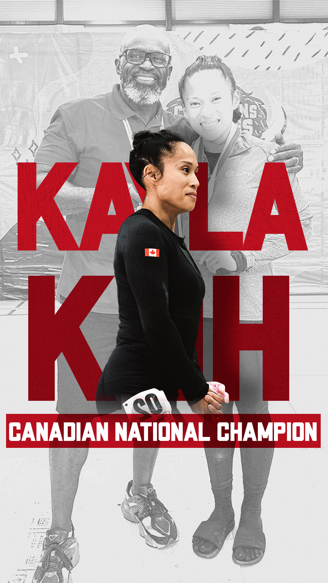
Working with LPS Athletic during my co-op (and now part-time!) has been such a rewarding experience. I’ve had the chance to redesign their website to feel more bold, clean, and true to who they are as a brand.
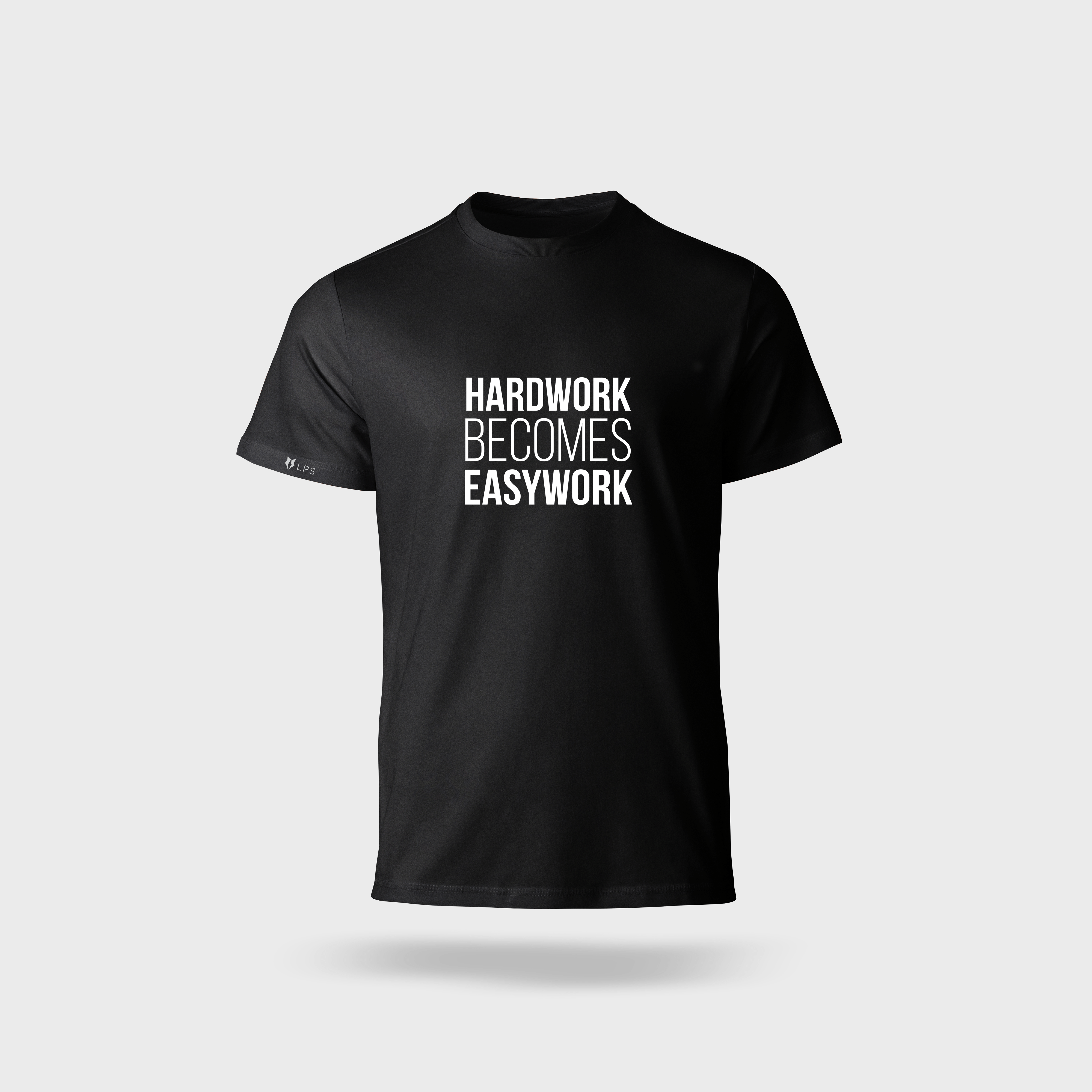
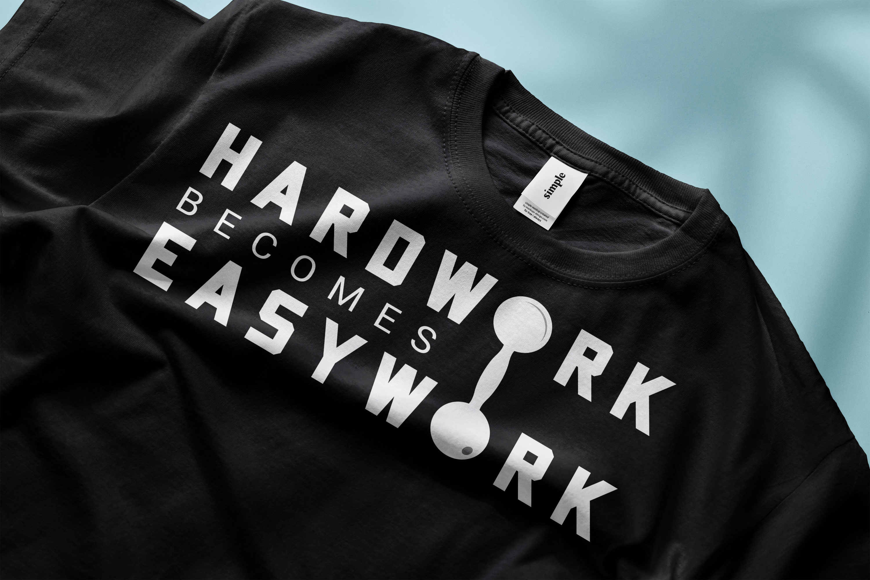
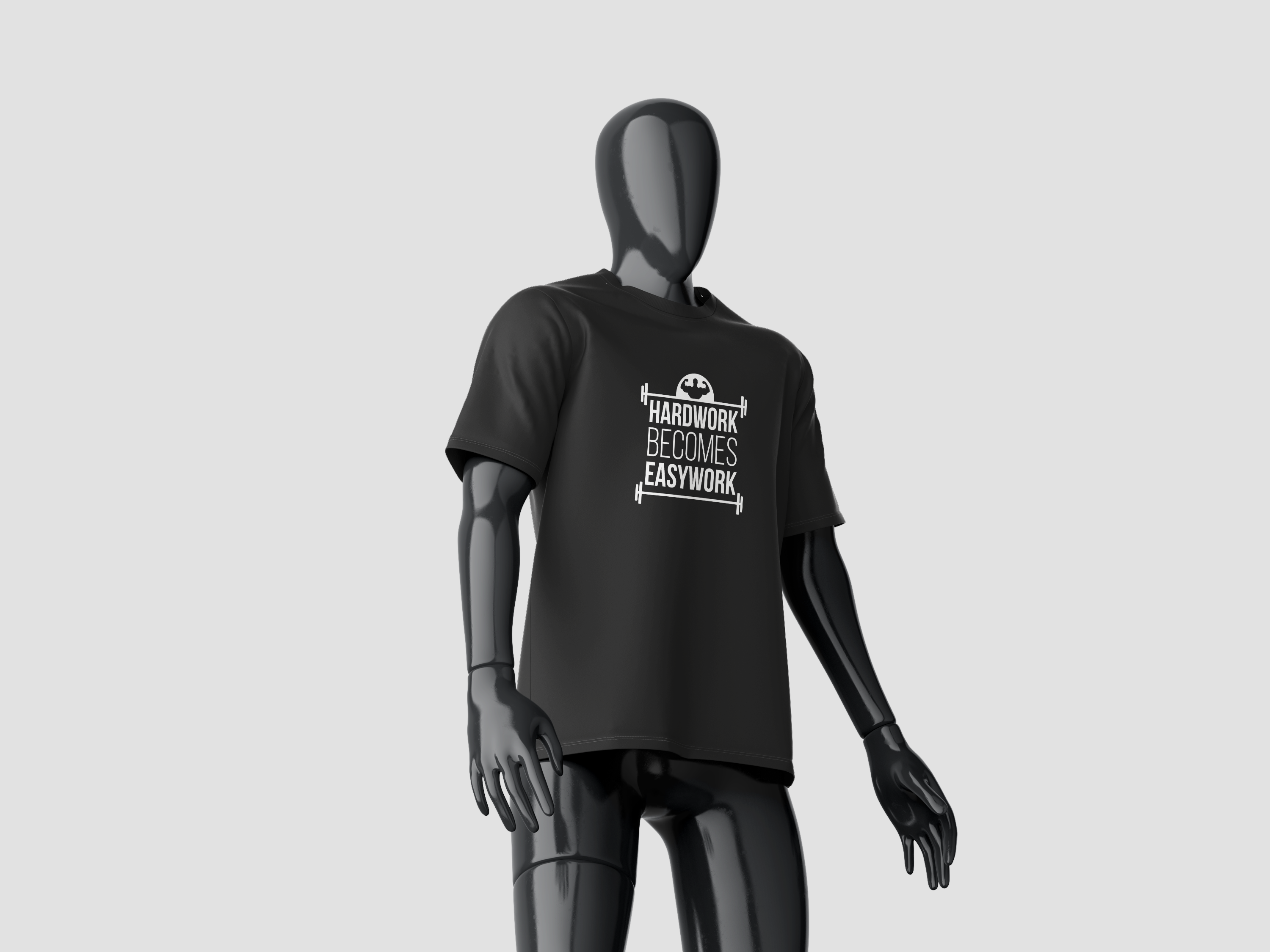
From creating transformation posts to shooting and editing reels that capture the emotion behind an athlete’s journey, every piece of work felt meaningful. I even got to design merchandise that fans and athletes could be proud to wear.
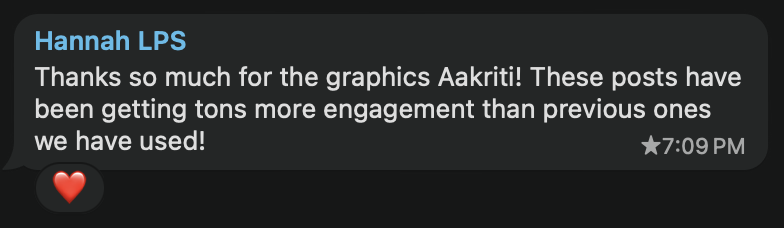
Seeing the engagement grow, appreciation from my manager and the brand’s message come through stronger has made this experience even more special for me.
1. Increase social engagement: To help LPS Athletic connect more deeply with their audience by designing content that encourages interaction through likes, shares, comments, and saves.
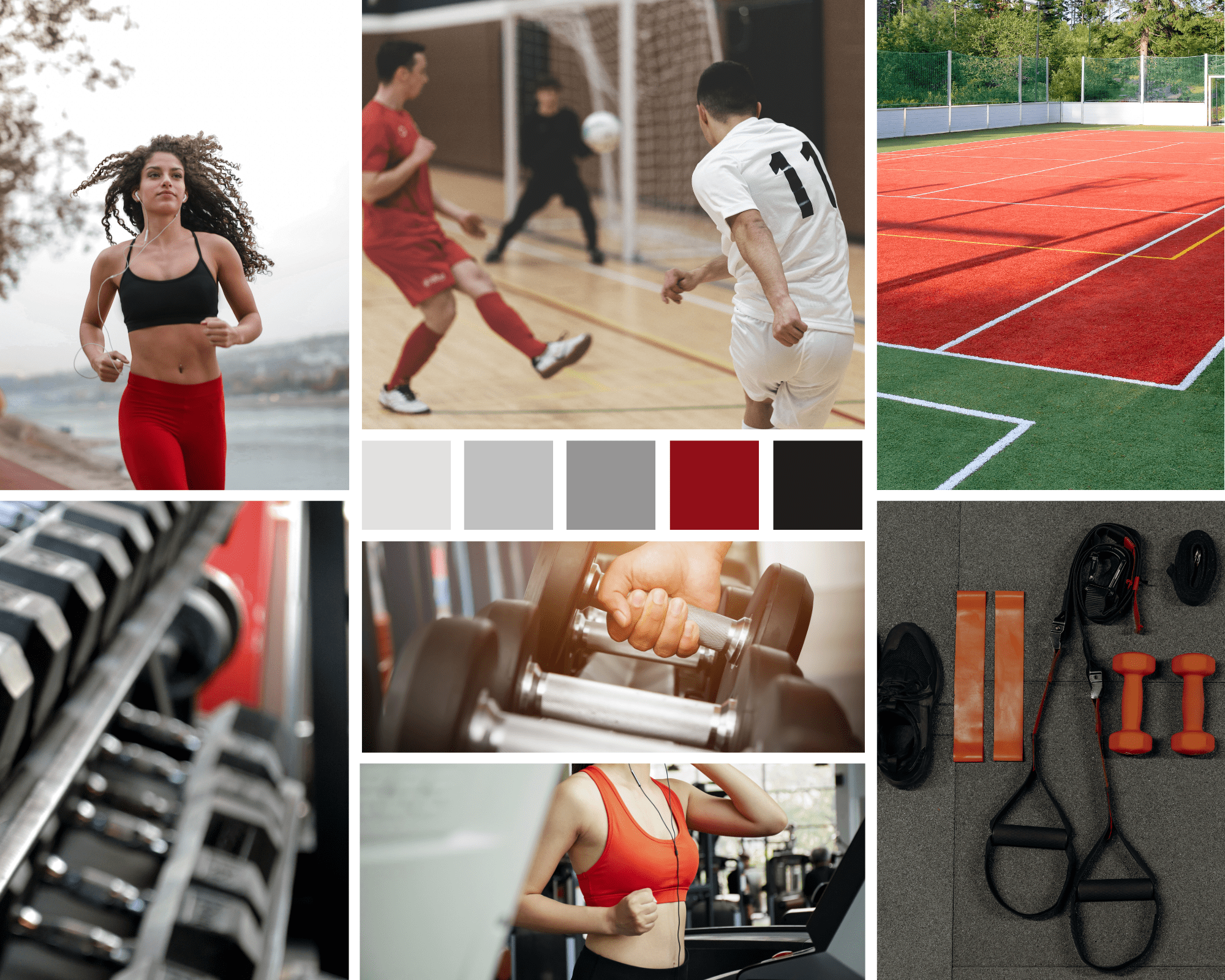
2. Design that reflects the brand: To build visuals that align with LPS’s high performance, energetic, and community driven values ensuring consistency across social posts, reels, and merchandise.
3. Boost Visibility Through Video Content: To capture the athletes' journey and emotions through reels, giving viewers a deeper look into how the brand empowers individuals to stand out and reach their full potential.To capture the athletes' journey and emotions through reels, giving viewers a deeper look into how the brand empowers individuals to stand out and reach their full potential.
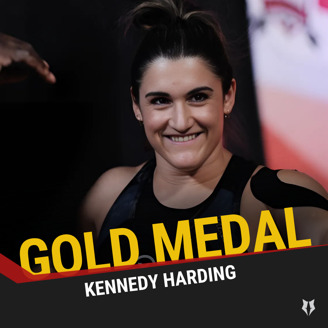
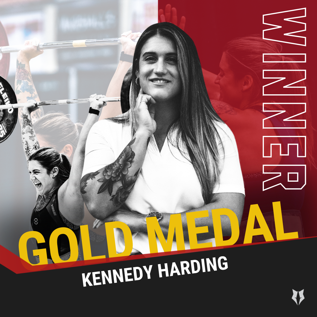
Social Media Posts
Merchandise Design