I was part of the design team at Imagimake, where I got to collaborate with some incredibly talented people to shape both how the products looked and how they were marketed.
From designing toy packaging and Amazon A+ pages to creating launch videos and visual instructions for new products I was closely involved in every step. How everything appeared across platforms? Yep, that was on me (no pressure!).
Imagimake’s products are designed for young, curious minds primarily children aged 4 to 12 and their parents, who seek fun yet educational toys. The visual design needed to appeal to both: playful, colorful, and engaging for kids, while also being informative and trustworthy for zparents making the purchase decisions.
To capture the fun, hands-on spirit of the brand, I created a playful and colorful moodboard that leaned heavily on vibrant, energetic visuals.
While the tone was bright and child-friendly, I made sure everything stayed aligned with the brand’s color palette to maintain consistency.

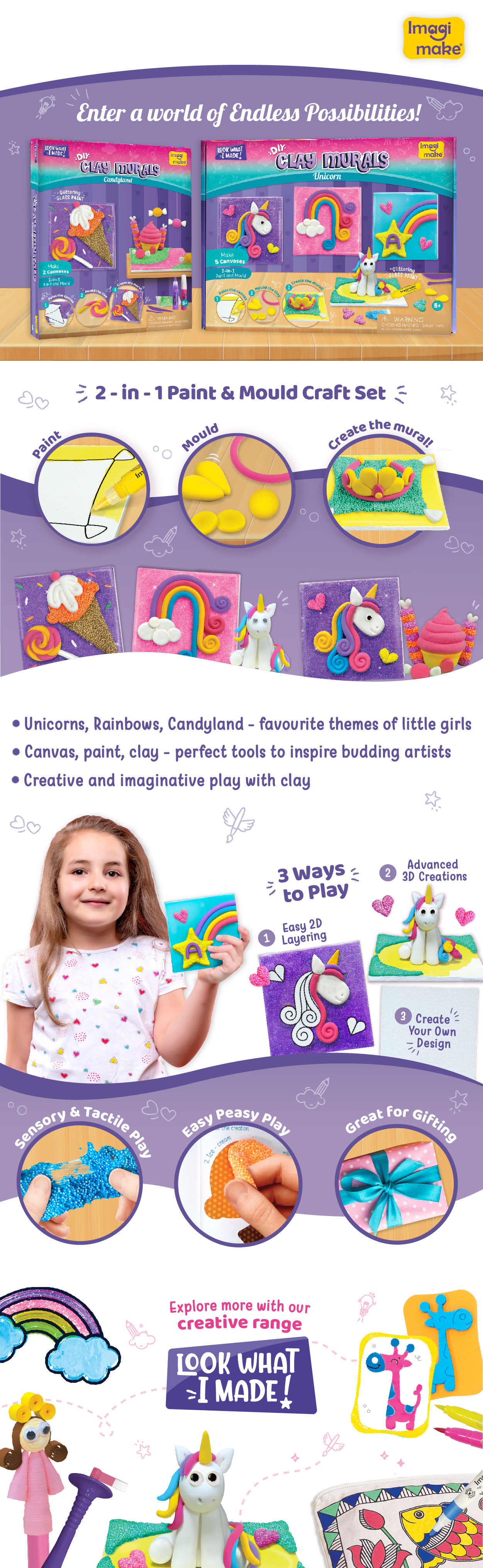
Product Name: DIY Clay Murals – Unicorn & Candyland Edition
Purpose:
This A+ content is designed to enhance the product listing on e-commerce platforms (like Amazon) by providing rich visuals and detailed product storytelling to:
- Increase conversions
- Reduce return rates
- Build brand trust
- Educate parents
- engage children
1. Hero Banner (Top Section)
- Immediate visual impact to stop scrolling and capture interest.
-Introduces the two product variants: Unicorn and Candyland — both highly appealing to the target audience (young girls aged 4–10).
-The tagline suggests open-ended play and imaginative possibilities, which is a core value for creative toys.
2. Process Flow – "2-in-1 Paint & Mould Craft Set"
- Simplifies the product concept and how to use it in a glance.
- Educates parents and assures them the activity is structured but creative.
3. Key Features
- SEO + Purchase Motivation: This section addresses top search keywords while tapping into parental desires for educational, imaginative toys.
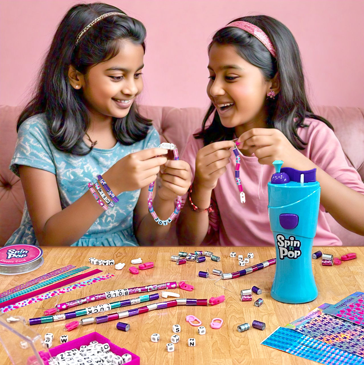
4. Lifestyle Section – “3 Ways to Play”
- Showcases age adaptability and long-term value.
-Connects emotionally by featuring a happy child parents imagine their own child enjoying the same.
5. Sensory + Educational Value
- Highlights developmental benefits and gift potential.
- Appeals to both emotional (fun) and rational (learning) buying motivations.
6. Cross-Sell Section “Explore More with Our Creative Range”
- Encourages brand stickiness by showcasing the larger product ecosystem.
- Improves average order value by inspiring bundling.
🎨 Color Psychology & Typography
Purple: Creativity, fantasy, magic ideal for unicorn and candy themes.
Yellow: Warmth, cheerfulness, attracts children's attention.
Pink: Softness, femininity matches the product's primary demographic.
Turquoise/Blue: Balance and trust, keeps things visually light and vibrant.
White space: Prevents overload and improves legibility.
Typography:Friendly rounded sans-serif font clear for parents, fun for kids.
Highlighted keywords in different colors or bold improves skimming and UX.
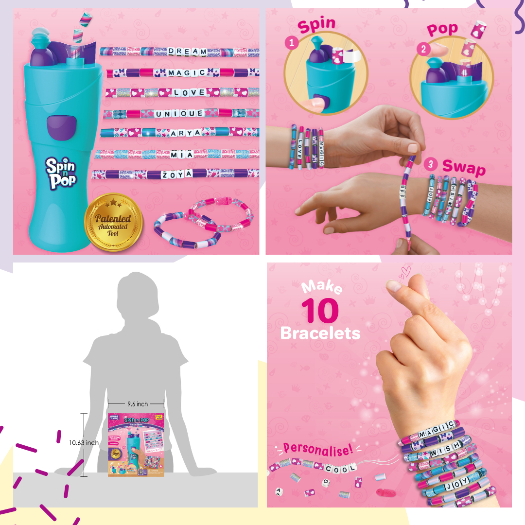
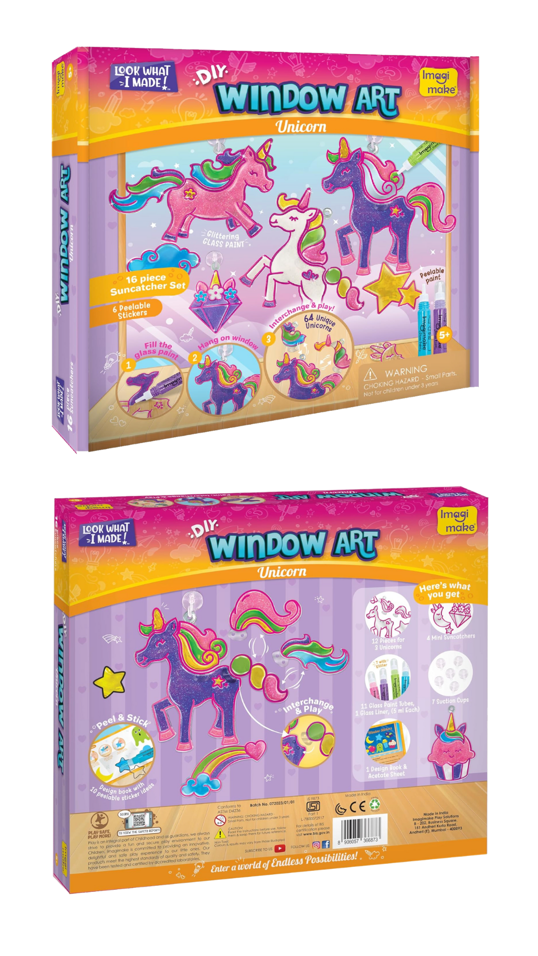
Listing images are the main product photos shown on e-commerce platforms. They usually appear in a gallery carousel and include the hero image, feature callouts, lifestyle usage, infographics, and comparison or bundle images.
✅ Why They’re ImportantFirst Impression:
The main image is often the first thing a customer sees crucial for stopping the scroll.
-Visual Storytelling: Additional images explain features, size, usage, and benefits in a clear, visual format.
-Builds Trust: High-quality, consistent images increase professionalism and make the product look reliable.
- Reduces Doubt: Helps answer common customer questions visually reducing return rates.
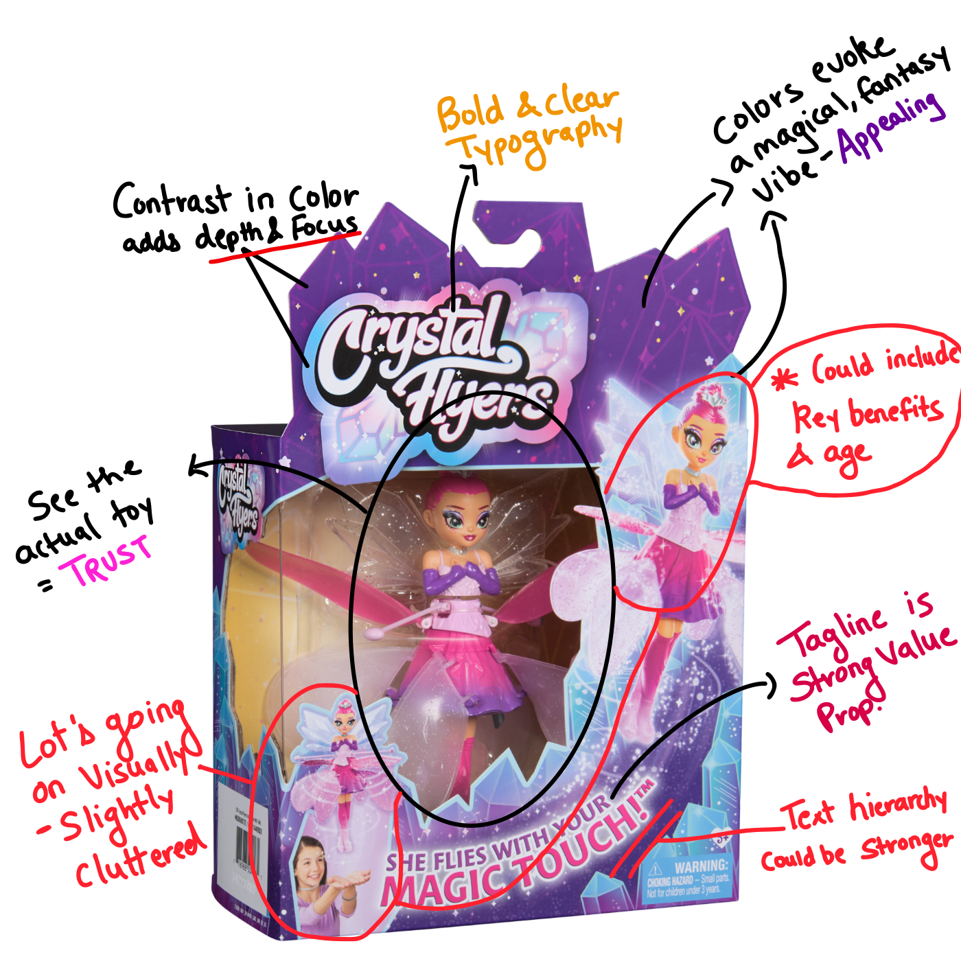
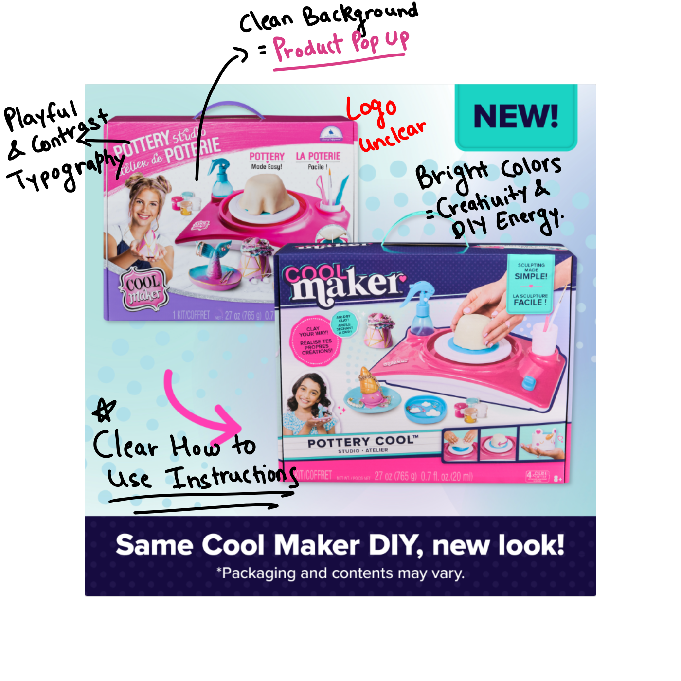
- Designing packaging at Imagimake was more than just making things look good it was about making them work.
- I started with competitor research to understand what was already out there, what stood out, and what felt cluttered. That research helped guide my decisions on layout, color choices, and hierarchy.
- I focused on creating packaging that was playful and vibrant to appeal to children, while also ensuring key information was easy to find and read for parents.
- I also designed visual instructions on how to use the product, keeping them simple, intuitive, and fun.
- Typography, colors, and structure were all thoughtfully chosen to maintain brand consistency while ensuring the box communicated clearly whether on a store shelf or a digital listing.
What I learned
My time at Imagimake was a hands-on crash course in designing for the real world.
- I learned how to adapt my creativity to suit business goals, work within brand guidelines, and create designs that are not only visually exciting but also practical and user-focused.
- From packaging and manuals to Amazon listings and product videos, I experienced how design plays a role at every stage of a product’s journey.
-Most importantly, I learned how to collaborate with cross-functional teams, take feedback with an open mind, and deliver work that supports both the product and the people using it.