
Ease is a mental wellness app designed for young adults and professionals seeking simple, accessible tools to manage stress and anxiety. It offers guided meditations, breathing exercises, mood tracking, expert insights, and a supportive community all in one place.The goal is to create a calming and intuitive experience through a user-friendly interface, a warm and soothing color palette, and minimal distractions, making mindfulness effortless and stress relief just a tap away. ✨
🧑 Young adults & professionals juggling work, studies, & personal life, looking for simple ways to manage stress.
🐣 Individuals new to mindfulness who want easy, no-pressure tools for relaxation and focus.
😵 Busy people on the go who need quick, effective techniques for stress relief without long commitments.
💫 Anyone seeking a calm digital space that feels welcoming, supportive, and distraction-free
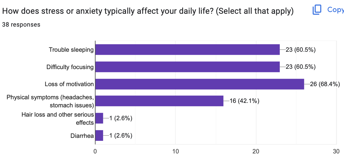
To better understand user needs, a survey was conducted to identify common stressors, symptoms, coping mechanisms, and expectations from a mental wellness app.
1. 🔹 Sources of Stress & Ease’s Solutions
Work, financial stress, academic pressure, relationships, and health challenges were major stressors. Easetackles these through guided meditation, mood tracking, breathing exercises, and expert insights.
2. 🔹 Preferred Coping Mechanisms:Users rely on talking to loved ones, exercising, journaling, and relaxation techniques. Ease incorporates community support, guided meditation, breathing exercises, and personalized journaling prompts.
3. 🔹 Why People Avoid Mental Health Apps:Lack of time, difficulty finding help, stigma, affordability issues, and lack of personalization were the biggest barriers. Ease addresses these by making self-care accessible, easy to use, and tailored to individual needs.
4. 🔹 Features Users Want: Therapy sessions with experts, Breathing exercises, Guided Meditation, Positive affirmations & CBT exercises, Community Support, Journalising


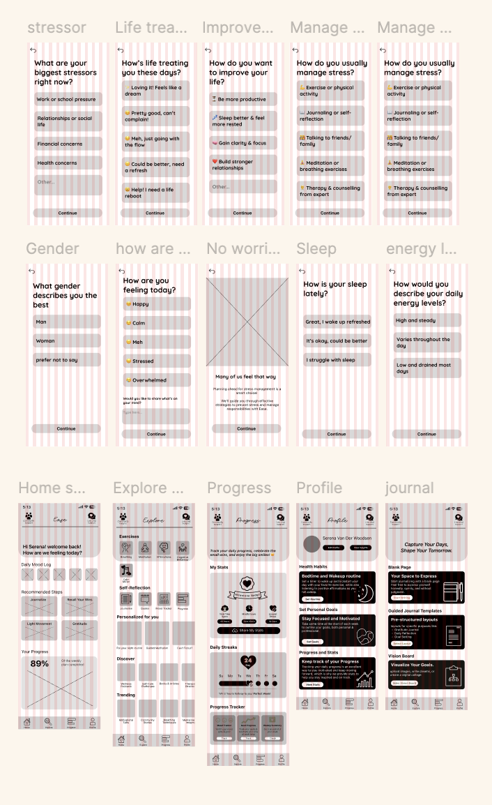
Problem:🔹Personalization:One-size-fits-all solutions don’t work for everyone users need a more personalized experience.
Solution:💡Ease starts with an in-depth onboarding process that understands user needs and tailors content, tools, and suggestions accordingly.

Problem:🔹Features - Mental health tools are scattered across different apps, making it hard to find everything in one place.
Solution:💡Ease integrates all essential features meditation, breathing exercises, journaling, expert guidance, and community support into a single, seamless platform.

Problem: 🔹Recommendations - Not knowing what to do when feeling stressed or overwhelmed.
Solution:💡Ease allows users to log their mood and concerns, then provides personalized recommendations with guided steps to help them regain control.

Problem:🔹Rewards & Reminders - Forgetting to use the app or not having enough time for it.
Solution:💡Ease keeps users engaged with daily reminders, positive affirmations, and a streak system with badges turning mental wellness into a rewarding habit.


✅ Most users appreciated the guided onboarding process and felt it helped personalize their journey effectively
❌ One participant wanted an option to retake onboarding after setup
✅ Users appreciated the variety of options having a blank page, templates, and guidance made journaling feel more accessible and less overwhelming.
✅ The vision board feature was a hit, with users excited about visually representing their goals and dreams.
✅ The AI chatbot received positive feedback for being quick and gentle in tone.
✅ Users liked having 24/7 access to instant support and coping tips.
✅ Users loved that they didn’t have to dig through menus to find stress relief tools.
❌ A few users were unsure about the difference between meditation and breathing exercises at first glance.

Design Grounded in Real User NeedsWorking on Celesta reminded me how essential it is to design with users, not just for them. Through surveys and usability testing, I was able to identify pain points like navigation struggles, trust in online purchases, and the desire for personalization. These insights shaped meaningful features—from AR try-on to detailed product info—that made the app feel intuitive and relevant.
Feedback That Shapes FunctionalityUsability testing with peers and professors gave me more than just surface-level feedback—it helped me see where users hesitated, got stuck, or felt unsure. Rather than relying on assumptions, I made design decisions based on what real users experienced, which led to smarter UI tweaks like clearer back-navigation and better filtering.
Iteration is EverythingThis project showed me the power of small, thoughtful changes. With each round of feedback and revisions, the app became smoother and more user-friendly. Iterating on wireframes and flows helped catch issues early and build a stronger foundation before moving into visual design.